When my son, Ben and I began to work on The Boy Who Went Ape, there was a lot of head scratching. I mean what do we know about apes? Grunt, grunt, scratch, scratch. Hey, wait a minute! The more we thought about it the more we realized that we had a lot in common with our jungle brothers. A LOT.
We went to visit Ben and Amy up in Victoria, Canada, to work on the book together. This photo shows Ben before coffee. "Mumble, mumble, yeah sure, mumble, mumble." Notice the elephants on the window sill. Ben has always loved elephants, and somehow they ended up hidden in each illustration in the book. Weird.
Ben thought it would be cool to make a story that blended Blueberries For Sal and Curious George. So he did. He also posed for the illustration of the zoo keeper. Ben's darling wife, Amy, even got into the act.
See no evil
Hear no evil
Speak no evil
Susi and I went to the Oregon Zoo to shoot chimps. What? No, with a camera. I also did some life drawings. This was invaluable for understanding their anatomy, but also their movement, energy, and personalities.
This chimp was my favorite. Delilah. At first she ignored me, but when I stayed for a couple of days, she got curious. She would eventually pose for me and then peer at my drawings to give me her critique.
Here is the cover art underway. I painted with sumi ink and acrylic on paper made of elephant dung. That's right. Elephant do do. Splato. Jungle apples. Monster mash. Jumbo pie. Oops, I stepped in something and it's up to my waist. Mound bars. Cow, make that elephant paddies, Titanic turds, you get the idea.
Note to yuckophiles: the paper is made in Sri Lanka, and they wash away the yuck to make beautiful paper out of the plant fibers. This unique paper received ink beautifully, but was tricky when it came to the acrylic, because it was so super absorbent.
Here is the under-painting for the illustration of Miss Hush in the library.
A little more color has been added. The final illustration in the book has more color yet.
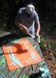
Here I am using re-cycled paint to make borders. I used a stick to drip the paint so the lines would look vine-like and kind of herky-jerky. Since the book is a silly and wild romp, I wanted the art to verge on out of control.


